
AI Resume Builder Templates: How to Choose an ATS-Friendly Resume Format
The prettiest resume template can be the reason you never get a call back — if an applicant tracking system can’t read it, the design is working against you. A good AI resume builder hands you templates that already pass those parsers, according to guidance from CareerOneStop, the U.S. Department of Labor’s resume resource, so you pick a look and the format stays ATS-safe by default.

This guide covers what actually makes a template ATS-friendly — single-column layout, standard section headings, safe fonts, the right file type — and which resume format (chronological, functional, or hybrid) gives a parser the best chance of reading you correctly, plus what to strip out before you hit submit.
What Makes a Resume Template «ATS-Friendly»
Before a recruiter ever opens your file, software reads it first, and that first read decides whether a human sees it at all.
An ATS reads text, not design
An applicant tracking system (ATS) parses your resume into structured fields — name, dates, job titles, skills — before a person ever looks at it. Nearly 98% of Fortune 500 companies — and about 70% of large companies overall — run some form of ATS, according to Jobscan’s applicant tracking system usage report. The widely repeated claim that only «25% of resumes pass the scan» traces back to an uncited 2012 vendor pitch with no published methodology, but the underlying point still holds: a resume with the wrong layout gets flagged, misread, or buried before it ever reaches a recruiter’s average six-to-seven-second glance.
An ATS-friendly template is simply one whose text a parser can extract without losing or scrambling anything. That’s a narrower bar than «looks professional» — a template can win a design award and still fail the parsing stage, because the two things a human eye and a parsing engine reward are not the same.
The elements that break parsing
The usual culprits, roughly in order of how often they cause trouble:
- Tables and multi-column grids
- Embedded graphics, icons, and skill-rating bars
- Text boxes
- Headers and footers holding contact details
- Photos and headshots
- Colored or shaded backgrounds
Older ATS engines read a two-column layout as one long, scrambled line of «gibberish» instead of two separate streams of text, and OCR-based scanners frequently lose contrast — and therefore content — on shaded or colored backgrounds.
The fix is mechanical, not creative: one column, plain text, no decoration standing between your words and the parser. None of these elements add information a parser can use — a logo or a skill-rating graphic communicates nothing to software that only reads text, so every decorative element is pure downside for ATS compatibility even when it helps the resume look sharper to a human reader.
Single Column vs Two Columns
Layout is the single biggest lever a template controls, and it comes down to one choice.
Why one column wins
A single-column layout reads the way a parser expects — linearly, top to bottom, left to right — so nothing about the order of your experience gets lost in translation. Two-column templates can look sharp to a human, but a meaningful share of ATS engines merge the columns during parsing and can’t tell which line belongs to which section.
For an ATS-friendly resume template, one column is still the closest thing to a guarantee. It costs almost nothing visually — plenty of professional-looking templates are single-column by design — while removing an entire category of parsing failure at the source.
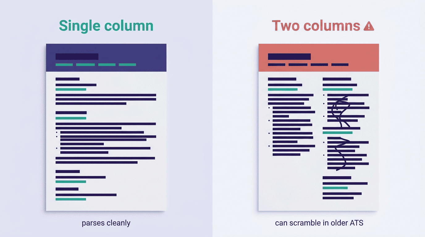
Here’s how the two layouts compare on the points that actually affect parsing:
| Factor | Single column | Two columns |
|---|---|---|
| Reading order | Linear, top to bottom | Can be merged or scrambled by older ATS |
| Compatibility | Safe across nearly all ATS versions | Depends on the specific parser |
| Visual design | Simple, plain | More graphically striking |
| Recommended default | Yes | Only with a modern, tested ATS |
When a second column is (sometimes) safe
Newer, OCR- and AI-driven ATS platforms handle simple two-column designs more gracefully than older keyword-matching engines did, but there’s no universal standard for which platforms an employer runs behind the scenes, so there’s no real guarantee across every hiring pipeline.
When in doubt, stay with one column; a solid AI resume builder tool keeps the underlying structure single-column even when a template looks visually balanced with two, so the design risk never lands on you.
Applicants should aim to make their resumes as easy as possible to analyze for the ATS systems. This means that difficult-to-read fonts and fancy formatting may make it harder for the system to parse out relevant experience and skills. Simple is best.
Khaled Hussein, co-founder and CEO of Betterleap, via SHRM
Choosing the Format: Chronological, Functional, or Hybrid
Layout controls whether the ATS can read your resume at all; format controls how well it understands the story your experience tells.
Reverse-chronological is the ATS default. Around 90% of job seekers use this format, listing the most recent role first, and it’s also the easiest for a parser to interpret correctly — clear dates, clear job titles, clear employers in a predictable order, which is exactly the pattern an ATS is built to expect.
Functional resumes carry the highest ATS risk. This format leads with a skills summary and pushes work history — and often dates — toward the bottom or out entirely, which strips away the chronological signal a parser relies on to build an accurate timeline. Recruiters and ATS logic alike can read a functional resume as an attempt to hide employment gaps, even when that isn’t the intent.
Hybrid format is the middle ground. It opens with a skills or qualifications summary but still lists work history in reverse-chronological order underneath, keeping the dates and structure a parser needs while giving skills more visual prominence. It parses better than a pure functional resume without sacrificing all of the flexibility functional formats offer.
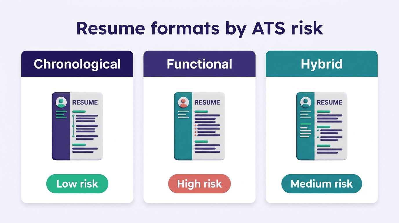
The choice should follow your work history, not your design preference — a career with steady, relevant roles has little reason to move away from reverse-chronological.
Fonts, Sections, and File Type
The last layer of ATS-friendliness sits below the layout and format: the actual fonts, headings, and file you send.
Fonts and section headings
Stick to plain, widely supported fonts at 10-12pt for body text:
- Arial
- Calibri
- Georgia
- Garamond
- Helvetica
The idea that Times New Roman is mandatory is a myth; any clean, standard font parses fine, and the safer rule is simply to avoid decorative or script fonts an ATS engine may not have installed.
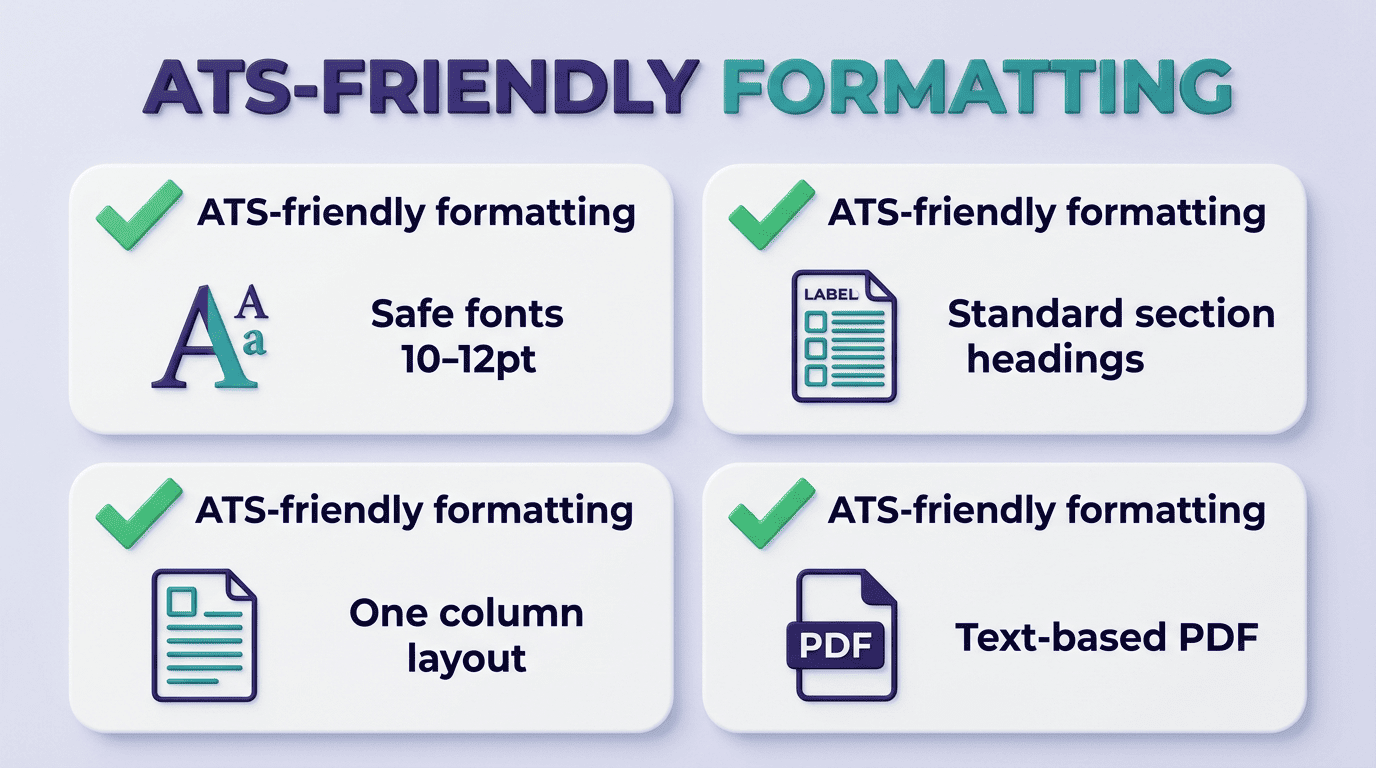
Section headings matter just as much: label them the way a parser expects — Header, Summary, Experience, Skills, Education — in that order, rather than inventing creative labels like «My Journey» that a parser won’t recognize as a standard section. A parser matches against a limited set of known labels, so a heading that reads perfectly well to a human can still return an empty field to the system if it doesn’t match anything in that set.
Common section headings and the safer ATS-recognized alternative, side by side:
| Creative heading | ATS-safe alternative |
|---|---|
| «My Journey» | Summary |
| «What I Bring» | Skills |
| «Where I’ve Worked» | Experience |
| «Credentials» | Education |
A quick way to sanity-check a template before you commit to it:
- Copy the resume text and paste it into a plain-text editor.
- Check that it still reads top-to-bottom, left-to-right, in the original order.
- Confirm dates, job titles, and employer names are intact and unscrambled.
- Verify no section — contact info, skills, education — is missing from the pasted text.
- Search the pasted text for your target job’s key terms to confirm they survived the format.
- If anything is missing or out of order, simplify the layout and retest before applying.
PDF or Word?
A text-based PDF — one exported from a document, not scanned as an image — is the safe default for the large majority of modern ATS platforms and preserves formatting exactly as designed. The one exception: if a job posting explicitly asks for a .docx file, send Word instead of overriding the request with a PDF.
The simplest path is to build a resume with AI that exports both formats already ATS-clean, so the file-type decision doesn’t cost you a second thought. Whichever format you export, run the same copy-paste check described above — a scanned or image-based PDF will fail that test immediately, which is exactly the case you want to catch before an application goes out.
A few file types to avoid outright, since they frequently return blank or garbled fields to a parser:
- Scanned or image-based PDFs
- .pages exports
- .odt files
- Plain image formats like .png or .jpg
How AI Resume Builders Keep Templates ATS-Tested
Choosing a safe layout by hand is possible, but a builder that has already done the testing removes most of the guesswork.
Good builders test their templates against real ATS engines and back that up with a live ATS resume checker score. A few examples of how this shows up across popular builders:
- Rezi offers 16 ATS-friendly templates built around single-column, parser-safe structure.
- ResumeUp.AI runs a similar approach with 20-plus ATS-tested templates and an ATS resume checker that returns a 0-100 score across 28 checks in under a minute.
- Teal offers a library of more than 100 templates alongside its own resume-building tools.
Across all three, the pattern is the same: the design choices are already validated against real ATS engines like Workday, Greenhouse, iCIMS, and Taleo, so a job seeker picks a look rather than reverse-engineering parser behavior themselves.
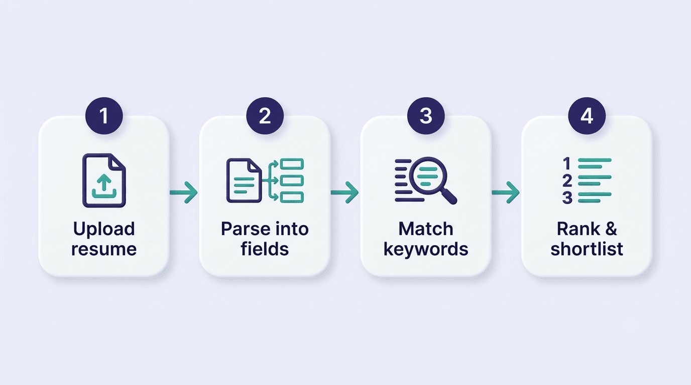
That built-in testing is the practical difference between a template that merely looks professional and one that’s confirmed to survive OCR parsing, keyword extraction, and section detection before it ever reaches a human recruiter.